As big data continues its dominance of business and IT news, line of business users more than ever want intuitive ways to tell narratives through data. Data visualization is a great advancement helping business users go beyond just data and analytics to drive true business insights. As part of its larger Google Analytics 360 Suite, Google has introduced Google Data Studio 360 and its free counterpart, Data Studio, as its most recent additions to the data visualization realm.
Swipe to View Gallery of Google Analytics 360 Suite Images
Views of Google Analytics 360 and Data Studio 360 interfaces
While we’ll save digging fully into Analytics 360 for another post, let’s explore what Data Studio 360 and Data Studio can do here.
Data Studio vs. Data Studio 360
Data Studio 360 is an enterprise visualization and reporting platform for enterprise, and Data Studio was developed for smaller teams with 5 reports available per user. Both versions offer unlimited connections to data sources, and unlimited report viewing, editing and collaboration.
For anyone used to working in Google Docs or Drive, the Data Studio user experience will be familiar—it was built using the same infrastructure as Google Docs. Sharing reports is like sharing Docs or Sheets in Drive. Multiple teams can receive reports and add their own data to them, helping businesses gather holistic views of performance.

Google Data Studio 360 Data Sources
With Data Studio 360, users can connect data, create drag-and-drop quick visualizations and share reports with teams. Data Studio users can even create heatmaps using tabular data.
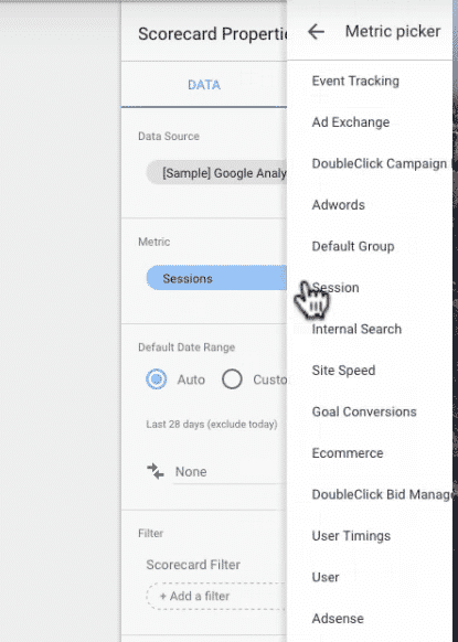
For business and marketing users in particular, popular sources of data—like Google Analytics, Google Adwords, Google Sheets and more—can now be reported from with more attractive visualizations.

Data Studio has multiple data connectors to the above-mentioned sources plus BigQuery (and soon, SQL databases) so users can easily create dashboards or reports from multiple types of data.
Preloaded Reports and Live Data
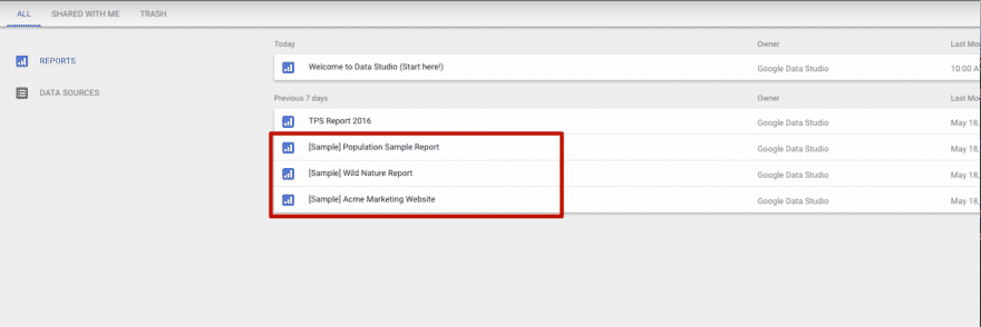
Data Studio comes with several preloaded sample reports to help you understand what’s possible in the platform. Once you’ve developed a report, you can preview it as others would see it, complete with live data.
When the report has been shared with a team, recipients can can adjust parameters, like the date range, and update the data if the report creator has given them access to do so.
Summary
Google Data Studio 360 presents an interesting mix of spartan simplicity and aesthetically robust pre-built reports. It is built to streamline the navigation necessary to drill down into popular metrics from common data sources, and appears to be designed for line of business professionals.
One particularly interesting metric to watch in the coming year will be how Data Studio 360 fares on Gartner’s 2017 Business Intelligence Magic Quadrant. The 2016 Magic Quadrant included updated criteria placing more weight on ease of use and intuitive visualization capabilities, and Data Studio 360 is clearly aiming to fit that bill.


